



By Shreya Vaghani 15 Sep 2026
10 Best Successful Rebranding Examples of All Time
"Of all time" is a bold claim for a marketing list, so it's worth being specific about what that means here. This isn't 10 random logos that looked nice. It's 10 moments, spanning almost 25 years, where a company changed how it looked and sounded, and the rebrand actually worked. Sales moved. Perception shifted. People still bring up the campaign years later.
Line them up in order and something interesting happens: you can watch the practice of rebranding change over time. Early on, most of this list is a company fixing a specific, obvious problem: wrong logo, wrong tone, wrong name. Toward the end, rebrands start doing something bigger. They're not fixing a problem so much as declaring what the company believes.
What Is Rebranding?
Rebranding means changing a company's public brand identity: name, logo, messaging, or brand positioning, to reflect a real shift in the business or how it wants to be perceived. It's different from a brand refresh, which is a smaller, cosmetic update (a modernized logo, a new colour palette) done without changing the name or core strategy. A full rebrand usually only works when the identity change matches something that's already changed inside the business.
10 Rebrands That Worked
1. Lego (early 2000s)
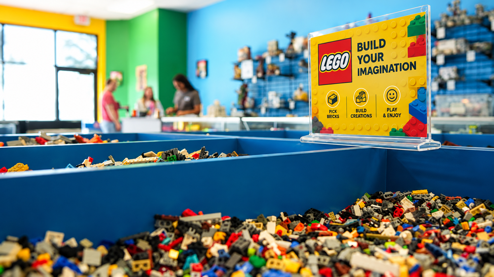
Lego had wandered into theme parks and niche playsets, chasing growth that had nothing to do with what made it Lego. The fix was almost stubbornly simple: back to open-ended building and its most loyal fans. Sales grew roughly 900% over the following decade. Sometimes a rebrand isn't about becoming something new. It's about remembering what you already were.
2. Old Spice (2010)
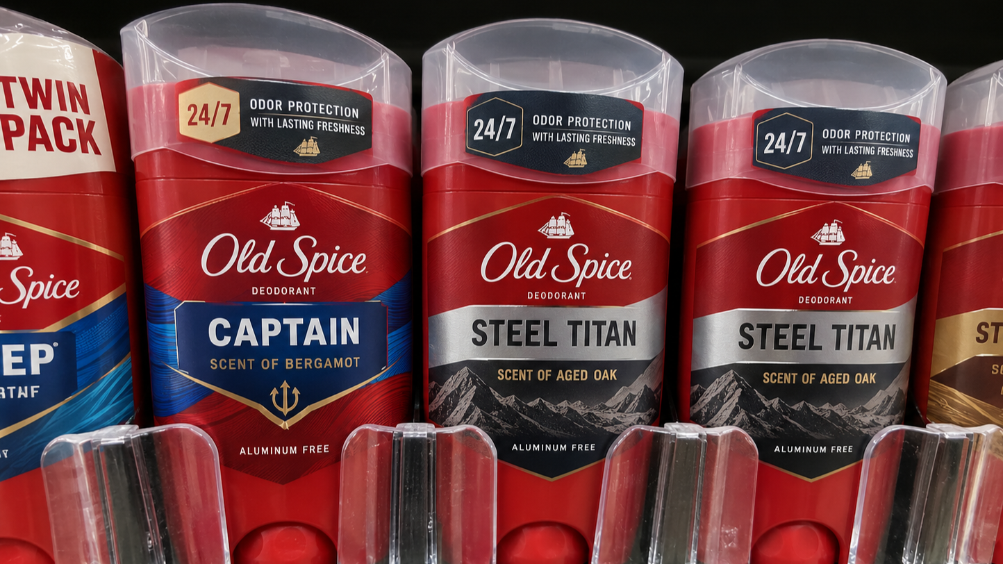
Young men saw the brand as something their fathers used. The 2010 campaign leaned into absurd, shareable humour, and "The Man Your Man Could Smell Like" became the ad people forwarded instead of skipped. Sales were up well over 100% year over year within six months.
3. Airbnb (2014)
By 2014, Airbnb had outgrown its scrappy, college project look. The new Bélo symbol and full visual identity overhaul leaned into brand purpose, belonging, and trust, because convincing strangers to stay in each other's homes required exactly that.
4. Instagram (2016)
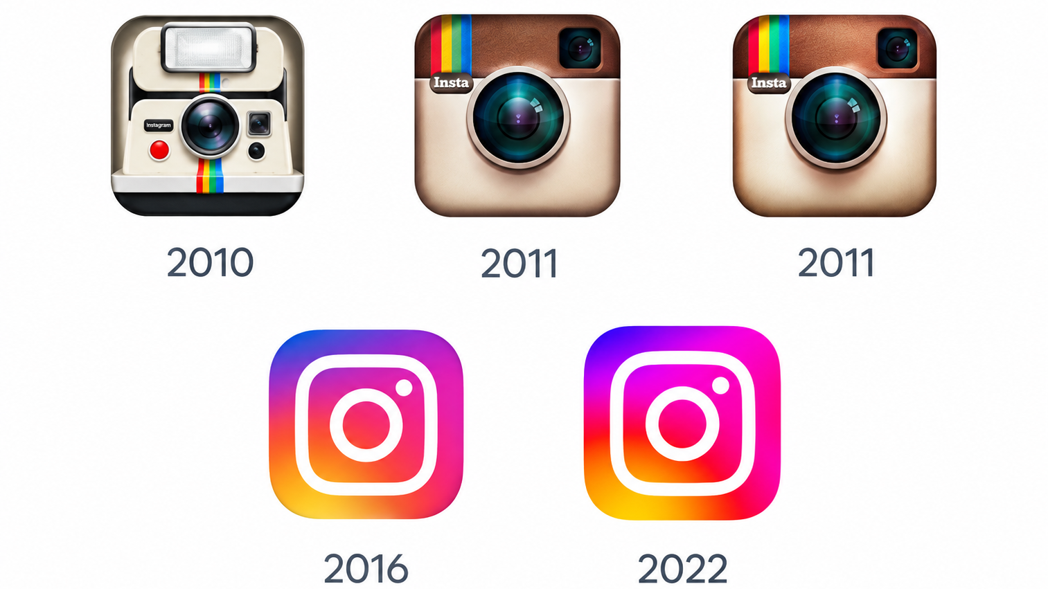
The beloved Polaroid icon no longer reflected an app built around video, stories, and messaging. Instagram simplified it into the flat, colourful logo redesign everyone knows now, proof that not every outdated identity needs a funeral, just an update. A decade later, Instagram touched its identity again, this time just the wordmark, not the icon.
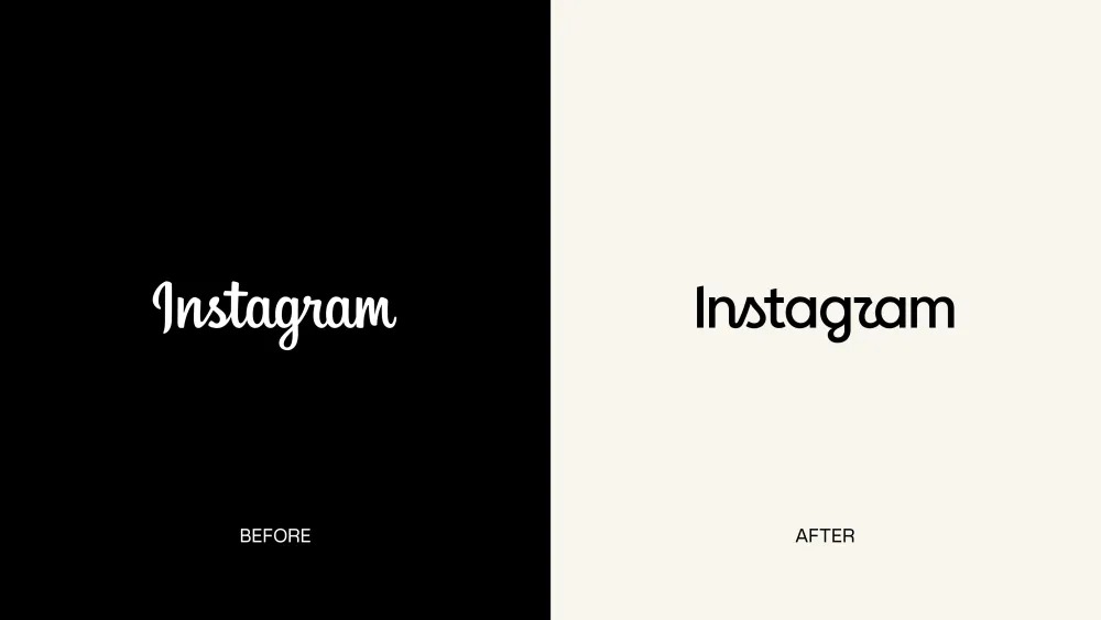
The 2026 refresh swapped in sharper, more modern lettering, and the internet immediately noticed the new "r" looked a lot like a "z," turning "Instagram" into "Instagzam" online within hours. Small changes get noticed just as fast as big ones when the brand is this familiar.
5. Taco Bell (2016)
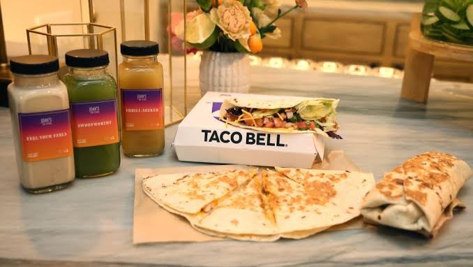
Investing in app ordering and city-format "Cantina" stores meant the old identity wasn't flexible enough. A modular visual identity system kept core brand consistency across every touchpoint while letting each format adapt. Less glamorous than Old Spice, arguably more useful: most companies just need their brand to work across ten formats without falling apart.
6. Dunkin' (2019)
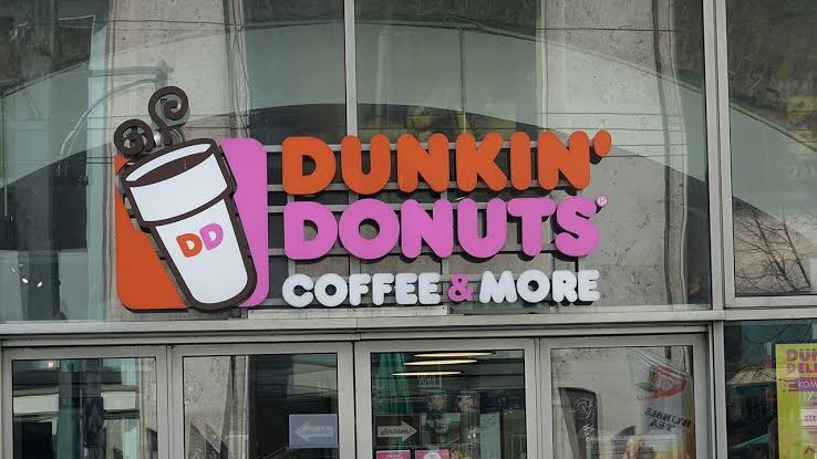
Dropping "Donuts" from the name looked small; it wasn't. Beverages had become the more profitable half of the business, and customers already thought of Dunkin' as a coffee stop first. The branding didn't create the shift. It just caught up to one that had already happened.
7. Burberry (2023)
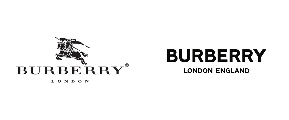
While luxury fashion converged on flat, minimal sameness, Burberry brought back its classic serif logotype and knight emblem, leaning into brand heritage no competitor could copy. Like Dunkin', it worked because it told the truth about the brand.
8. Mozilla (2024)
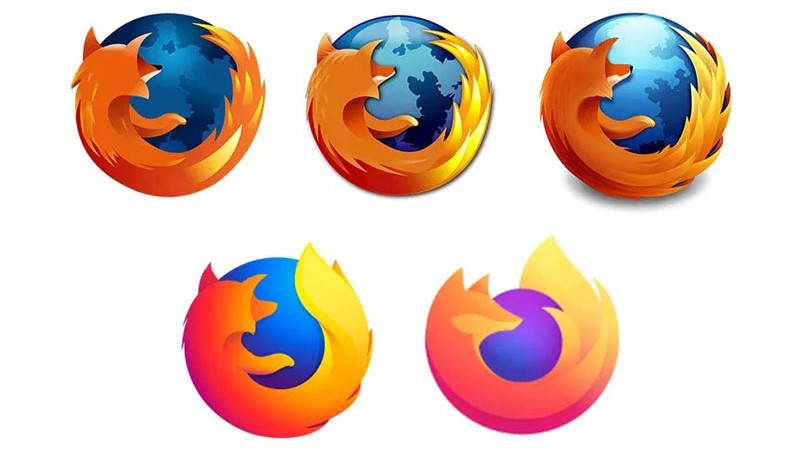
This one wasn't just a new look. It was a position. Mozilla leaned into the idea that the internet had become locked down by a handful of platforms, pulling in 1990s computer typography and a dinosaur and flag logo, half nostalgia, half activism. Lego and Old Spice fixed a problem; Mozilla made an argument.
9. Decathlon (recent)
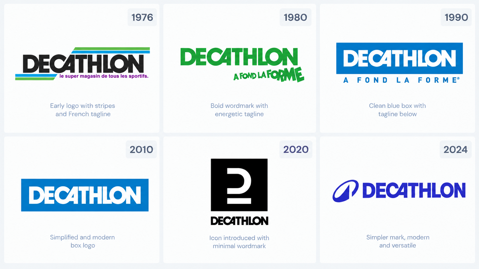
Decathlon's old story of effort and competition didn't land with younger, casual customers who just wanted to move and have fun. Wolff Olins rebuilt the brand identity around joy and accessibility, replacing dozens of confusing sub-brands with one unified identity and improving brand architecture.
10. Eventbrite (2025)
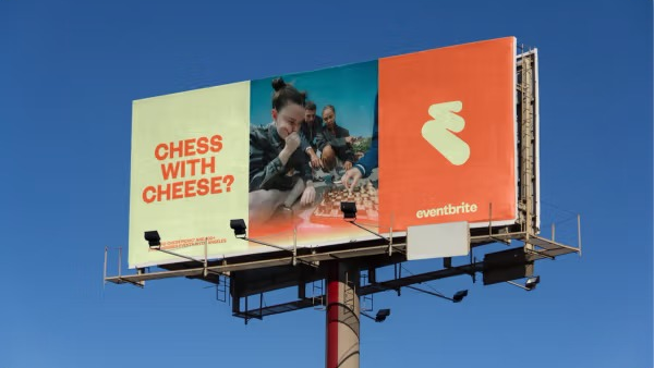
Once background noise at the bottom of a ticket, Eventbrite's "Free Flowing Electricity" rebrand (bold colour, illustrated mascots, real personality) tried to make the brand part of the experience itself, not just the transaction.
What Changed Over 25 Years?
Early rebrands fixed one clear problem: a name, logo, or tone out of step with the product. Later ones increasingly solve for meaning, giving the brand a belief system rather than just a better look. The pace has also picked up: companies used to rebrand once and leave it alone for a decade; the last few examples here happened within a two- year window. And the stakes rose: Dunkin' and Instagram had room to be conservative; Mozilla and Eventbrite didn't, because standing for nothing in a crowded market is now its own risk.
Older rebranding strategy isn't outdated, though. Taco Bell's modular system is still more relevant to most businesses than Mozilla's manifesto, because most brands don't need a cause. They need brand consistency across ten formats. The lesson isn't "be bolder." It's "know which problem you actually have.
If You Are Considering a Rebrand
● Start with research, not design. Understand how people actually see your brand first.
● Test it small. Roll out in one market or channel before committing fully.
● Watch brand sentiment, not just numbers. A good click-through rate won't tell you how customers or your own team feel.
● Explain the reasoning. People trust a rebrand more when they understand why.
● Keep what still works. Every example here, even the boldest, held onto something. Full erasure reads as panic, not confidence.
Conclusion
Twenty- five years, ten companies, one thread: the identity changed because something real had already changed first. Lego remembered what it was. Old Spice found a voice it never had. Mozilla turned a redesign into a cause. The branding told the truth about the business, and people believed it because it was true.
If your brand is starting to feel like it's telling an old story, that's usually the first sign it's time to look closer. Arowa Webtech works with businesses on brand strategy and digital marketing, helping them figure out what problem a brand actually has before touching a single design file.
FAQ
Frequently asked question
Rebranding overhauls a company's brand identity and brand positioning; a brand refresh is a smaller cosmetic update that keeps the name and strategy intact.
Lego, Old Spice, Airbnb, Instagram, Taco Bell, Dunkin', Burberry, Mozilla, Decathlon, and Eventbrite are among the most cited successful rebrands.
Usually the business hasn't changed enough to justify the new look, and customers can tell the difference.
When your audience, offering, or brand positioning has genuinely shifted, such as after a merger or reputation crisis, not just to look current.
It can, when tied to a real brand strategy shift, as Old Spice's fast sales spike and Lego's decade-long growth both show.
Anywhere from a few months to well over a year, depending on company size and rollout phases.
No, Old Spice barely touched its logo and still pulled off one of the most talked-about rebrands ever through tone and marketing alone.
Older rebrands fixed a specific visible problem, while newer ones increasingly aim to give the brand a clear brand purpose.
It depends on scope; Arowa Webtech fits businesses that need strategy and research handled alongside the rebrand's design rollout.
